Sunday, December 11, 2011

fall semester is almost over

It is seriously crazy how fast the semesters go by when we're working hard!  I'm working on finishing up my projects this weekend/tomorrow so I won't have to worry about them while studying for tests. Here is my type project!


Here is the link to my behance project for type magazine layouts HERE.

Tuesday, December 6, 2011

lesson learned

Well, apparently constantly saving one's project is not precaution enough.  My computer constantly shuts down while I'm working in photoshop (going to get it checked out over break), so I've become accustomed to saving my files constantly.  Well tonight, the program shut down, literally, just as I was finishing my Fast, Cheap and out of Control poster.  When I opened the file back up after turning my computer back on, this is the file I was greeted with:
GAHHHHHHHHHHHHHHHHHHHHHH.
That is how I feel right now. Want to cry.

SO close to being done.

So now, I will be saving my files in multiple locations, multiple times a minute.  If you need me tonight, I will be completely reconstructing my poster.

Wednesday, November 30, 2011

more type notes


What are some ways to indicate a new paragraph?
A new paragraph can be indicated in many different ways.  There is the standard tab or extended space between the end of one paragraph and the beginning of the next.  Drop caps are also a standard way to break up paragraphs.  One could use symbols, rules, color, tracking, size and many other text applications to indicate a new paragraph.

What are some things to look out for when hyphenating text?
When hyphenating in text there are a few rules to keep in mind.  Hyphenating should occur where there are natural pauses, avoiding widows and orphans, and avoiding hyphenating names and proper nouns.  One should also make sure to leave at least 2 characters on the line and 3 following, avoid beginning or ending consecutive lines with the same word, and avoid ending lines with the words: the, of, at, a, by…

Define font hinting. Why is this necessary?
Hinting is a technique to avoid disturbing rounding errors in low-resolution digital type.  This is necessary for the display of type on screens, monitors and displays.

What is letterspacing/tracking? How do you track in Illustrator or InDesign?
The space between letters is known as letterspacing or functional white space.  It is essential for legibility.  Tracking is adjusting that white space between the letters.  There is a tracking adjustor in Illustrator and InDesign, when you have the letters you want tracked highlighted you can lessen the space or extend it.

Define Kerning? Name 8 kerning pairs. How do you kern in InDesign or Illustrator?

Kerning is moving type closer together in order to close gaps. It is necessary for certain letter combinations.  Av, Aw, Ay, Ta, Te, To, Tr, Tu, Tw are just a few of those pairs.  There is a kerning adjustor in Illustrator and InDesign, when you have the letters you want kerned highlighted you can lessen the space.

I got 80, needs some work.

What is word spacing?
Word spacing in typography refers to the size of the space between words, rather than the space between letters or sentences.

Explain DIN.
DIN is the standard sizes or starting points for paper sizes.

What is a baseline grid?
The baseline grid is an imaginary grid upon which type sits.  Type can be forced to snap to this grid.  The grid maintains continuity across the pages of a design.

How many characters per line is optimal? Is there a range?
It depends on the size of the font and the typeface.

Define aesthetic text alignment (optically hanging punctuation).
Some letterforms (such as the circular characters ‘o’, ‘c’, and ‘e’) extend over the baseline otherwise they would look optically smaller than their upright relatives.

What is a typographic river?
Occur in justified text blocks when the separation of the words leaves gaps of white space in several lines.

What is a widow?
A widow is a lone word at the end of a paragraph

What is an orphan?
An orphan is the final one or two lines of a paragraph separated from the main paragraph to form a new column

Monday, November 28, 2011

thanksgiving break

way, way too short.  Only two more weeks of classes though!  That means working hard to finish projects. Here is a snippet of what I'm working on for each class.


Above are my two favorite spreads thus far for my type project.

Tuesday, November 15, 2011

photographers you should know

Edward Steichen:
The Little Round Mirror — 1901
The Flatiron — 1904
     Edward Steichen was born in Luxembourg in 1879 but his family moved to the United States three years later and he was raised in Michigan.  At the age of fifteen he began a lithography internship and took up photography in 1895 but continued to paint as well.  Steichen denounced impressionistic photography and instead concentrated on realism. He later wrote: "I am no longer concerned with photography as an art form. I believe it is potentially the best medium for explaining man to himself and his fellow man."

HERE are some high quality images from Steichen, along with some from Stiegltiz and a couple other photographers.
HERE is a link to a short bio about Steichen.
HERE is a link to an exhibition of portraits by Steichen.  There are many varied images here.

Stephen Shore:
Coronado St., Los Angeles, CA —1975
Merced River, Yosemite National Park — 1979
     Although Shore has taught photography (he has been director of photography at Bard College since 1982) he became well known at an early age as a pioneer of color art photography. He is among the earliest fine art photographers to work almost exclusively in color. Shore became interested in photography as a child: Between the ages of six and ten he taught himself how to expose and print photographs. Walker Evans's book, American Photographs , made a big impression. At fourteen, the precocious teenager telephoned Edward Steichen, the photography curator of the Museum of Modern Art. They arranged a meeting, and Steichen purchased three of Shore's photographs for the museum's permanent collection. And at sixteen he met Andy Warhol and frequented the artist's studio, photographing the illustrious scene at the "Factory." In 1972 Shore embarked on a series of cross-country trips and made "on the road" color photographs of American landscapes.

HERE is a link to an interview with Stephen Shore and also a lot of his images.
HERE is a link to the gallery Shore often exhibits at and is a part of.  There are many images and some information about him there.
HERE is a short biography on Shore by the Getty Museum.

Robert and Shana Parkeharrison:
Flying Lesson — 2000
     Robert and Shana ParkeHarrison have been collaborating for years in creating artistic photographs.  Both Robert and Shana ParkeHarrison have college degrees in Fine Arts. After completing his bachelor’s in Fine Arts at the University of New Mexico, NM, in 1990, Robert ParkeHarrison obtained a Masters in Fine Arts at the Kansas City Art Institute, MO, in 1994 and Shana received a Bachelor’s in Fine Arts from Williams Woods College, Fulton, MO, in 1986. Currently, the ParkeHarrisons reside in Great Barrington, Massachusetts, near the college of the Holy Cross, where Robert teaches photography. In The Architect’s Brother, named in 2000 as one of “the Ten Best Photography Books of the Year” by the New York Times (DeCodorva), the couple portrays our environmentally shattering world in starkly poetic monochromatic photographs.

HERE is the link to their website.  There are many images of their current work and some past exhibitions.
HERE is a short biography on the two collaborating artists.
HERE is a post with some large images of their surreal photos.

Inez van Lamsweerde & Vinoodh Matadin:
      Vinoodh Matadin studied fashion design in Amsterdam between 1981 and 1985, and started working after finishing his studies. When he met Inez van Lamsweerde in 1986,  she was an art student at Gerrit Rietveld Academie (1985–90), and the two became partners both professionally and in private. In their collaborations they moved between art and fashion, and rather than making comments on fashion from an outside point of view, they’ve instead become a part of the system. Still, they’re best known for images that can be interpreted as both critical and slightly disturbing. Matadin & van Lamsweerde introduced digitally manipulated photographs at an early stage, allowing them to explore questions about gender and sexuality, reality, superficiality, and identity.

HERE is their website, apparently they also dabble in music videos?
HERE is a magazine these two regularly shoot for with some links to some of their photographs.
HERE is a link to an article about them and their apartment.  It is interesting to see how their home is decorated and designed based off the type of photography they do.

Jeff Brouws:
Signs with Signification Grid
Abandoned Auto Packard Plant, Detroit
     Jeff Brouws' work in photography captures the social experience and cultural relevance of classic American iconography. From highway landscapes of run-down motels and neon-lit gas stations to carnival scenes of small-town side-shows, Brouws' "visual anthropologies" offer a somber view of contemporary Americana. Born in San Francisco in 1955, Brouws is a self-taught photographer. His work is in major museum collections including the Museum of Modern Art, New York; The J. Paul Getty Museum, Los Angeles; The Art Institute of Chicago; and the Santa Barbara Museum of Art.

HERE is his personal website with many of his works included.
HERE is an interview with Brouws.
HERE is a short biography of Brouws along with some images.

Ed Burtynsky:
     To describe Canadian photographer Edward Burtynsky's work in a single adjective, you have to speak French: jolie-laide. His images of scarred landscapes -- from mountains of tires to rivers of bright orange waste from a nickel mine -- are eerily pretty yet ugly at the same time. Burtynsky's large-format color photographs explore the impact of humanity's expanding footprint and the substantial ways in which we're reshaping the surface of the planet. His images powerfully alter the way we think about the world and our place in it.

HERE is Burtynsky's website.
HERE is a short bio on Burtynsky along with links to other helpful websites with his works.  There are also videos of him speaking about his works.
HERE is an interview of this artist.

Sunday, November 13, 2011

GDR 272-319

Packaging Notes:

Shown in these pages are some great examples of smart packaging and different ways to interpret concepts or ideas.

The Penguin Books are very clean, simple and elegant designs.  They also embrace vibrant colors, but in a limited sense.  Their books also embrace simple iconography with one illustration or one image or even occasionally just text.  Sometimes the connection between what the book is about and what is on the cover is easily seen (The Later Roman Empire) while other times, a bit more of interpretation is required (Books v. Cigarettes).

New Directions takes on a more modern practice.  There designs are more non-traditionally based using handmade elements.  It gives the covers a more one-of-a-kind feel.

Zone Books uses hardly any imagery - more patterned and typographic based designs.

McSweeney embraces a more package based approach — they're more complex designs that seem to interpret what the material is about and come up with a more interactive package design.  Their designs also seem more like collector's edition type designs.

Pocket Canons seem to be aiming at summing up the novel in one image - you could look at the cover and know what you are getting yourself into when you pick it up to read it.

The books that I respond to most in these pages are the ones with an interactive element.  I would like to try and incorporate something along these lines in my design.

Fast, Cheap and Out of Control does not have one overlying message or one interpretation — it was described by its director as low-concept.  Therefore, it leaves itself open to interpretation and maybe more room to explore package designs.

In order for ones product to grab the attention of consumers, it must be unlike anything else.  It must jump off the shelf and be completely original.  I need to reanalyze my initial sketches and come up with more out of the box ideas.

Packaging can be a ton of fun and the most successful packages interpret their products and present them to the consumer in a nice, easy to understand manner.  One must look at all aspects of their product in order to deliver the best design possible.

Saturday, November 12, 2011

Wednesday, November 9, 2011

Letter Fountain 37-51

Tonight I printed my poster set full size:

I'm afraid my background color on the informational poster is too dark :/ I'll have to play with that but I'm liking where they're heading.

Here are some notes on the Letter Fountain reading assigned:
  • What are small capitals? How are they different than something set in ALL CAPS?
Small capitals are smaller versions of capital letters.  They are not simply reduced capitals but especially designed small capitals.  They have a slightly bigger x-height than lowercase letters and a matching weight — making them different from something in all caps.  They are also generally wider than capitals.
  • Does your font have small caps? If not name a font that does.
Yes, Serifa has small caps.  Syntax is another font with small caps.
  • What are ligatures? why are they used? when are they not used? what are common ligatures?
Ligatures are combinations of character that were designed because the overhanging ascender in 'f' would crash into an ascender of the dot of an 'i' if it directly followed the 'f'.  It is as if the terminal of the 'f' is extended to replace the end mark on the i.
For most sans serifs, this occurrence is not a problem and ligatures would not need to be used.  Another ligature is the & sign - originally a combination of the e and t.
  • Does your font have ligatures? If not name a font that does.
Serifa does not have ligatures as it is virtually a sans serif.  Bembo is a font with ligatures.
  • What is the difference between a foot mark and an apostrophe?
An apostrophe can be viewed as a 'nine' and is mainly used to show possession within a sentence.  A foot mark, on the other hand, is literally a foot mark.  5' is equal to five feet.
  • What is the difference between an inch mark and a quote mark (smart quote)?
A quote mark is either a double 'six' or 'nine' depending on which side of the statement the mark is on.  They signify the statements in between were spoken word or quoted from another source.  An inch mark, signifies an inch.  They are two straight marks. 5" is equal to five inches.
  • What is a hyphen, en dash and em dashes, what are the differences and when are they used.
A hyphen is used as a symbol to break words. (ex-ample)
An en dash is longer than a hyphen and is used to demarcate a parenthetical thought or to indicate a sudden change in thought. (here – there)
An em dash is used to demarcate parenthetical thought in English texts, but the dashes are unspaced. (here—there)

Wednesday, October 26, 2011

Letter Fountain 94-124

Lowercase letter — generally drawn slightly thinner than capitals

Classification according to form and construction — the 26 characters can be arranged into groups, separate for capitals and lowercase

Visual corrections — letter forms are often made to be visually appealing by slightly extending curved forms beyond the baseline and top line, changes are also made to the spacing between them (not all equal spacing), words should have fluid formation

First letters designed — H, O, n, l, o, and p (sometimes R, a, and g) are the first letters designed in a typeface

Letter 'O' — An enormous number of subtle variations are made to the form of the 'O', defines the curved counters for other letters

Letter 'l' — Defines the thickness of the stem

Letters 'c' and 'e' — logical steps after designing 'o', drawn narrower than the 'o', lower terminal of the 'c' is different in almost every typeface, lowercase 'e' has no serif

Rounded letters with a stem — 'd' 'b' 'p' 'q', even the most geometric typefaces contain subtle differences, connection between the curve and the stem presents a challenge

Letters with 'legs' — four letters all stem from the 'n': 'n' 'h' 'm' 'u', could also include 'r', uniformity is greater in sans serifs

Capital N, A, V, W, M — very angular

Capital H — very similar to E and F, has many "soul mates"

Outsiders — 's' 'a' and 'g', more complicated than a simple circle, thick-thin contrast must match up with the rest of the typeface, the 'a' consists of a bowl and curves, the 's' contains no straight lines, capital s is usually an enlarged version of the lowercase slightly lighter, capital and lowercase versions of the 'g' are constructed in completely different ways

Capital A — simply an inverted 'v' with a crossbar, very closely related

One legged letters — 'l' 'i' 'j' 'f' 't', generally not problematic

Diagonals — 'k' 'z' and 'x', k is a combination of inner and outer forms, busy central area, designers usually prefer thicker diagonals

other characters — since the introduction of the computer, these characters have become more important

duck dissected book

Here's an online version of my duck dissected book from our first project for Viscom.


Serifa Research


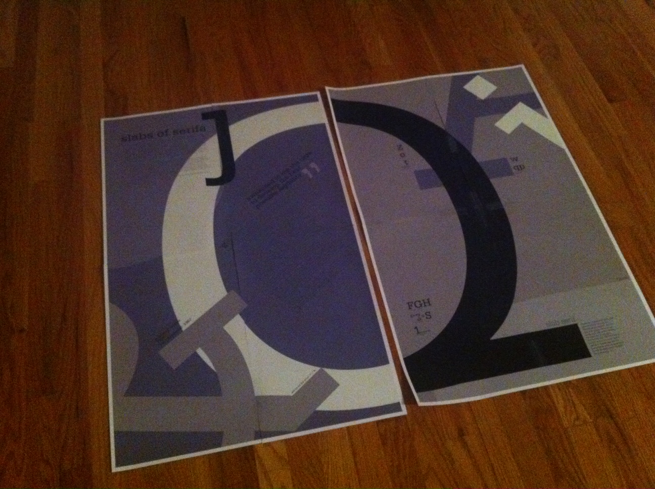
Serifa and Slab Serif (1000 words)
Serifa is a slab-serif design, based on the forms of Univers. Frutiger designed the font in 1967 to be used in a large variety of sizes.  The slab serif is a genre of letterforms that has been in use for almost 200 years. Throughout this time, many different sub-styles and groups have come in and out of use.  Serif terminals may be either blunt and angular (Rockwell), or rounded (Courier). Slab serif typefaces generally have no bracket (feature connecting the strokes to the serifs). Some consider slab serifs to be a subset of modern serif typefaces.  Because of their bold appearance, they are most commonly used in large headlines and advertisements but are seldom used in body text.  Serifa is different in this aspect as Frutiger designed it to be more legible.
As printed material began to branch out from the familiar realm of books, new typefaces were needed for use in advertising, posters, and flyers.  Vincent Figgins first commercially introduced slab serif printing type under the name Antique, with copies of specimen dated 1815 and 1817.  During the early 19th century, especially in Britain, letter drawers began creating thicker versions of letterforms common in European printing during the 18th century, e.g., the types of the Fourniers, Giambattista Bodoni, or the Didots. These new letter styles began to appear throughout British society. Artists, artisans, printers, and typefounders … they all would come to embrace these new ideas. In the realm of typefounding, these faces came to represent the age of industrialization, and also the beginnings of advertising. This also marked the birth hour for typefaces that would be marketed by their makers for “display” use. Quite common today!
As far as the typefaces go, the first examples seem to have been all-caps alphabets; faces with lowercase letters would come a bit later. In the UK, many of these early slab serifs were called “Egyptians,” even though they had very little to do with Egypt. Enthusiasm in Western Europe was quite high during this time period; Napoleon and his army had faced off against the British there, and hieroglyphics were in the process of decipherment. Perhaps the naming of typefaces as “Egyptian” had something to do with this popularity.  The following are some slab serifs fonts and how they came to be:
The first Clarendon was introduced in 1845 by R. Besley & Co, The Fan Street Foundry, as a general-purpose bold face for use in conjunction with other serif text faces in works such as dictionaries. In some respects, Clarendon can be regarded as a refined version of the Egyptian style and as such can be used for text settings, although headline and display work is more usual.  Clarendon styles have seen many revivals, especially during the 1950s and 1980s.  One of the first “contemporary” slab serifs for text in the Linotype library is probably PMN Caecilia™, which was designed during the 1980s by Dutch typeface designer Peter Matthias Noordzij. More recent releases include Diverda™ Serif, Aptifer™ Slab, and Generis™ Slab!  Many newspaper typefaces designed for the Linotype linecasting machines seem to have some Clarendon DNA in them, e.g. Excelsior™, Ionic™, or Impressum®. While close examination of many of the serifs in this category will reveal brackets, we believe that these typefaces may occasionally fall under the slab serif banner as well. In any case, they may be used superbly as text companions for display cousins whose slabs are more apparent, e.g., one could use Excelsior for body copy, and Memphis™ for the headline.
Two other families from this category worth extra attention are Egyptienne F™, by Adrian Frutiger, and Egyptian™ 505, by André Gürtler. Each of these families may be used to set both small as well as large point sizes.  A new wave of slab serifs hit the typographic world during the 1930s. Their style became very popular, and is still with us today. These letterforms appear to follow a “constructed” principle. Many of them have base forms similar to popular early 20th Century typefaces, but with slab serifs simply added on, i.e., Venus® and Venus® Egyptienne.
The groundwork for this sort of slab serif was laid in Frankfurt, Germany, when Rudolf Wolf designed the Memphis™ typeface at the D. Stempel AG foundry in 1929. After 1931, Linotype began to distribute Memphis matrices for its linecasting machines, bringing the face a worldwide audience. Memphis has a sans serif companion, DIN Neuzeit™.  Another popular German slab serif is Beton®, from Heinrich Jost. Beton has a geometric nature, and may be seen as a match for Futura®.  Adrian Frutiger’s Glypha™ and Serifa®, both designed during the 1960s, have also enjoyed widespread popularity. Both of these typefaces harmonize with Univers™.  This category includes display designs that are all dark and heavy, like Aachen™, or optimized rather for larger than for smaller sizes, like Lubalin Graph (which matches ITC Avant Garde Gothic™).  Many of the typefaces in this category are based on woodtype faces that were popular in the Wild West. One example of this “western” style is Neo Contact™, a typeface popularized by the way it is used by Marlboro.
This category of typeface has even stroke weights and heavy serifs.  Slab serifs can, as a rule, take quite a lot of wear and tear, even as far as paper is concerned.  But also here one must be careful with very light weights (danger of flooding) or very heavy weights (danger of sparkling).  While slab serifs are typically classified within serifs, their different visual attitude – defined by their thick, square-ended serifs – begs for its own category.  Also a popular style during the mid-nineteenth century, slabs have evolved into a combination of structures, like the Clarendons and Egyptians, which are constructed more like serifs, and the Geometrics, which are based on sans serifs designed to sport slabs.  And not all slabs are created equal: Geometrics and Egyptians lack brackets, the curvy connectors that segue stems and arms with the serifs like the Clarendons.

1967 History (311 words)
In 1967 the continued presence of American troops increased further and a total of 475,000 were serving in Vietnam and the peace rallies were multiplying as the number of protesters against the war increased. The Boxer Muhammad Ali was stripped of his boxing world championship for refusing to be inducted into the US Army. In the Middle East, Israel also went to war with Syria, Egypt and Jordan in the six-day war.  When it was over Israel controlled and occupied a lot more territory than before the war. Once again in the summer, cities throughout America exploded in rioting and looting — the worst being in Detroit on July 23rd where 7000 national Guard were bought in to restore law and order on the streets. In England a new type of model became a fashion sensation by the name of Twiggy and mini skirts continued to get shorter and even more popular with a short lived fashion being paper clothing. Also during this year, new Discotheques and singles bars appeared across cities around the world.  The Beatles continued to reign supreme with the release of "Sgt. Peppers Lonely Hearts Club Band" album, and this year was also coined the summer of love when young teenagers got friendly and smoked pot and grooved to the music of The Grateful Dead, Jefferson Airplane and The Byrds. The movie industry moved with the times and produced movies that would appeal to this younger audience including The Graduate, Bonnie and Clyde and Cool Hand Luke. TV shows included The Fugitive and The Monkeys. Color television sets become popular as the price came down and more programs were made in color.
            Frutiger’s Serifa does not appear to be a reflection of the times but perhaps a counter to the movements.  It is more geometric and structured than many of the “groovy” typefaces coming out of the decade.

Font Designer (525 words)
Adrian Frutiger is a well-known typeface designer born in Switzerland in 1928.  He is still alive and currently lives near Bern, Switzerland.  He is a prolific type designer with many typefaces to his name including: Frutiger, Univers, President, Apollo, Serifa, Avenir, OCR-B, Glyfia and Vectora.  At the age of 16 he started working as a printer’s apprentice.  From there he moved to Zurich and studied at the Zurich School of Arts and Crafts.
                 In 1952 Frutiger began his working career at Deberny and Peignot in Paris after being persuaded by type-founder Charles Peignot.  In 1962 Adrian Frutiger joined André Gürtler and Bruno Pfäffli in establishing a graphic design studio in Arcueil, a suburb of Paris. As a freelance typographer, Adrian Frutiger designed logos, fonts, and the corporate image of numerous companies. Adrian Frutiger gave top priority to legibility, the efficient transmission of content, as well as beauty in designing all his typefaces. "When I put my pen to a blank sheet, black isn't added but rather the white sheet is deprived of light. [...] Thus I also grasped that the empty spaces are the most important aspect of a typeface."  Frutiger was always interested in embracing new technology and applying it during his design process.  Besides solely designing original fonts, he would also interpret other type including Didot and Courier.  He has also produced numerous books on type, font and design.  He is still alive and has been working on revising his typefaces with Linotype.  One of his most famous typefaces, Univers, was the first family to use numbers as a naming system for its various weights (21 variations when first released).  The system was built around its Roman version — Univers 55.
            Frutiger still occasionally works with linotype and wrote the following on the companies web site:
I first experienced the power of type to make the whole intellectual world readable with the same letters in the days of metal. This awakened in me the urge to develop the best possible legibility. The time soon came when texts were no longer set in metal types but by means of a beam of light. The task of adapting the typefaces of the old masters from relief type to flat film was my best school. When we came to the “Grotesk” style of sanserif, however, I had my own ideas which led to the Univers® family. Technological progress was rapid. Electronic transfer of images brought the stepping, followed by my feelings for form. But today, with curve programs and laser exposure, it seems to me that the way through the desert has been completed.
From all these experiences the most important thing I have learned is that legibility and beauty stand close together and that type design, in its restraint, should be only felt but not perceived by the reader. In the course of my professional life I have acquired knowledge and manual skill. To pass on what I had learned and achieved to the next generation became a necessity.
            He has developed more than one hundred and seventy typefaces, of which many have become standard fonts, are now in daily use, and shape our reading habits.
           
Some Typefaces Frutiger Designed:
President (1952)
Phoebus (1953)
Ondine (1954)
Méridien (1955)
Egyptienne (1956)
Univers (1956)
Apollo (1962)
Serifa (1967)
OCR-B (1968)
Iridium (1975)
Frutiger (1975)
Glypha (1979)
Icone (1980)
Breughel (1982)
Versailles (1982)
Avenir (1988)
Vectora (1990)

Bibliography:
Gomez-Palacio, Bryony and Armin Vit.  Graphic Design Referenced. Beverly, Mass: Rockport Publishers, 2009. Print.
Linotype. “Font Designer Adrian Frutiger” and “Slab Serif Fonts.” Linotype. Monotype Imaging, 2011. Web. 24 October 2011.
Squire, Victoria. Getting it Right with Type. London: Laurence King Publishing, 2006. Print.
Typophile. “Adrian Frutiger.” Typophile, 2011. Web. 24 October 2011.

Tuesday, October 25, 2011

infographic ideas

Typographic:


Image Based:


Non-traditional:


Here are a couple info graphics I designed in the past for newspaper:

 zoomed in view:

Friday, October 21, 2011

posters posters and more posters

So this weekend we've been asked to create 18 posters for viscom and 7 for type.  That's a lot of posters.  I've started working on them today — so far I've got 3 complete and 1 in the works.  For viscom we are creating infographic posters that are typographic based, image based, and non-computer based.  Here is my favorite typographic poster I've got so far:

Wednesday, October 19, 2011

Thursday, October 13, 2011

Font Classifications

Old Style: 1475
   1. the axis of the thick-thin contrast slopes somewhat to the left.
   2. the crossbar of the lowercase 'e' is horizontal
   3. top serifs are roof shaped and have a trianglar form
Examples: Bembo, Garamond, Sabon, Albertina, and Palatino


Transitional: 1750
   1. Stress in almost vertical or slightly left
   2. Top serifs of lowercase are roof shaped
   3. Lowercase "e" has horizontal crossbar
   Examples: Baskerville, Concorde, Fournier, Perpetua, and Times New Roman


Modern: 1775
   1. the type faces show a strong emphasis on the vertical stroke
   2. sharp contrasts
   3. symmetry and sharp transition to the straight serifs, which are as thin as the thin parts of the letter
Examples: Didot, Bodoni, Walbaum, Linotype, and Didone


Slab: 1880
   1. Hardly any thick/thin contrast in the letters
   2. Heavy rectangular serifs are as thick as the letters themselves (defining characteristic)
   3. Differences in subdivisions are most clearly visible in lowercase letters (sometimes seen as sans-serif to which serifs were added — see lowercase "c")
   Examples: Serifa by Adrian Frutiger, Antique by Vincent Figgins, the first Clarendon by Robert Besley, Beton by Heinrich Jost, and Memphis by Rudolf Wolf


Humanistic Sans Serif: 1812
   1. Line widths are visually equal
   2. The extension on the lowercase "e" points to the right instead of turning toward the cross-bar
   3. The lowercase "g" often has a classic form with two bowls
   Examples: Gill Sans by Eric Gill, Profile by Martin Wenzel, Frutiger by Adrian Frutiger, Scala Sans by Martin Majoor, and Myriad by Carol Twombly and Robert Slimbach


Grotesk: 1898
   1. No Serifs
   2. Axis of Rounding is vertical
   3. Ascender height is usually equal to capital height and the curve of the lowercase "e" is pointed up towards cross-bar
   Examples: Akzidenz Grotesk, Helvetica, Univers, Arial, and Neue Helvetica


Geometric: 1920s
   1. no serifs
   2. link thicknesses are only visually and minimally corrected
   3. the axis of the roundings is vertical
Examples: Futura, Avant Garde, Eurostile, Erbar, and Neuzeit