Progress on my typography after effects video. The first 30 seconds. Give me some suggestions if you've got any!
Monday, April 23, 2012
McDonalds Type Video Progress
Progress on my typography after effects video. The first 30 seconds. Give me some suggestions if you've got any!

Monday, March 26, 2012
Coterie Poster
Here is my latest Viscom project. This project has taught me to be more patient and understanding. It also helped teach me to keep pushing myself.


Friday, February 24, 2012
busy, busy
Super, you got it, busy this weekend. Working on multiple, time-consuming things for all three studios this weekend! But right now I'm getting into all the projects, so it's still fun. Also working on portfolios for multiple sources. And helping a journalism friend out with a project in photoshop. Oh and starting to worry about summer plans/study abroad plans. Lots on the horizon, but loving this time of my life. Anyway, here are a few alternative tool drawings of elephants.


Monday, February 20, 2012
type class 2/20/2012
Today in class we designed notes to someone! I posted a note on my friends wall :) It made me feel good to share with a friend I haven't seen in forever. Today's class was fun. Can't wait to explore more.

Sunday, February 19, 2012
recent projects
Here are my latest two projects for Viscom and Type. Overall I feel pretty happy with my work and the products created. Let me know what you think!
Sustainable Product Redesign

Book Jacket Redesign

Sustainable Product Redesign

Book Jacket Redesign

Friday, February 10, 2012

Friday, February 3, 2012
marc johns
I love his work, check it out sometime: http://www.marcjohns.com/blog/
a couple of my all time favs below, I would love to get one tattooed but I'm afraid of needles. Damn it. Slowly working my way there — it only took me 19 years to pierce my ears (and I got light headed).


a couple of my all time favs below, I would love to get one tattooed but I'm afraid of needles. Damn it. Slowly working my way there — it only took me 19 years to pierce my ears (and I got light headed).

Thursday, February 2, 2012
latest book cover designs
Here are my top three designs as of now. I think my dishwasher needs the most work — I need to fins a way to incorporate a more organic handwritten type title since the other two are in that style. But they're starting to feel cohesive but distinctive at the same time.

Wednesday, February 1, 2012


Friday, January 27, 2012
initial packaging ideas
Take out Experience highlights:


Problem Definition:
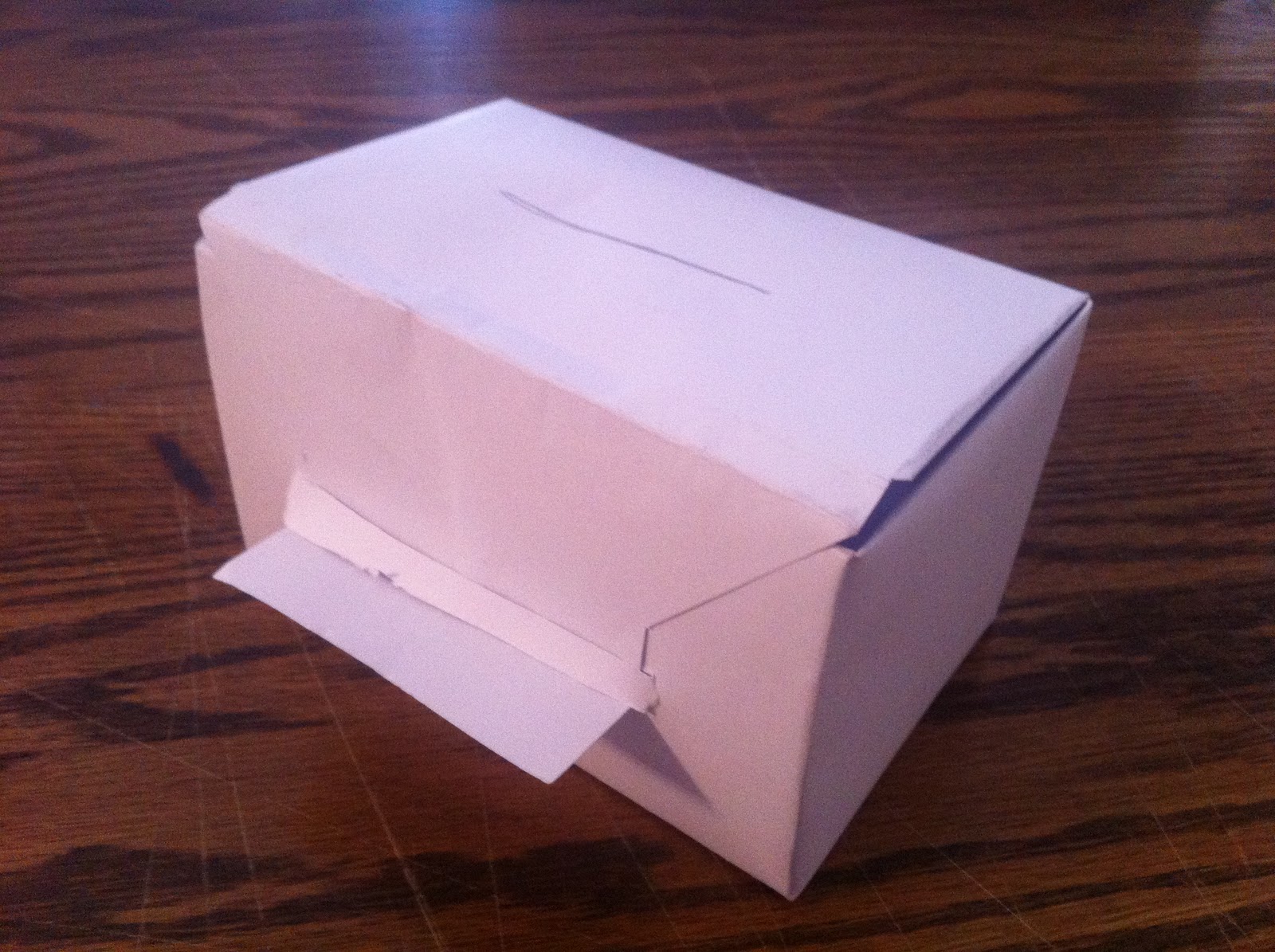
Although the Noodles and Company packaging is functional, there were a couple problems and the packaging could be a lot more sustainable. The sides of the pasta dish were too low, and pasta would spill over the side. There was also an excess of packaging — a large bag, pastic bowl and lid, paper bag for extras.
Packaging Mock-ups:
 Initial Design Explorations:


Problem Definition:
Although the Noodles and Company packaging is functional, there were a couple problems and the packaging could be a lot more sustainable. The sides of the pasta dish were too low, and pasta would spill over the side. There was also an excess of packaging — a large bag, pastic bowl and lid, paper bag for extras.
Packaging Mock-ups:

Wednesday, January 25, 2012


this means that
a few definitions...
sign: Signs can either be straight forward (EX: stop means stop) or can mean something other than themselves (EX: apple means healthy). Signs are not isolated, they are dependent on their context for meaning.
index: When there is a physical or casual relationship between the signifier and the signified, the non-arbitrary relationship that exists (EX: a black eye is caused by a punch)

symbol: Means "to throw together," a relationship is created where the first represents the second. (EX: scales = justice)
 |
| apple means temptation/healthy/fruit |
sign: Signs can either be straight forward (EX: stop means stop) or can mean something other than themselves (EX: apple means healthy). Signs are not isolated, they are dependent on their context for meaning.
 |
| Index: Woman appears to be dead. |
index: When there is a physical or casual relationship between the signifier and the signified, the non-arbitrary relationship that exists (EX: a black eye is caused by a punch)
symbol: Means "to throw together," a relationship is created where the first represents the second. (EX: scales = justice)
Friday, January 20, 2012
new fav blog
Found a new favorite blog that is super inspiring and full of greatness. Oh Joy! Check it out. They post about everything from design to food. Yum.
A few samplings...


A few samplings...


Sunday, December 11, 2011
fall semester is almost over
It is seriously crazy how fast the semesters go by when we're working hard! I'm working on finishing up my projects this weekend/tomorrow so I won't have to worry about them while studying for tests. Here is my type project!


Here is the link to my behance project for type magazine layouts HERE.


Here is the link to my behance project for type magazine layouts HERE.
Tuesday, December 6, 2011
lesson learned
Well, apparently constantly saving one's project is not precaution enough. My computer constantly shuts down while I'm working in photoshop (going to get it checked out over break), so I've become accustomed to saving my files constantly. Well tonight, the program shut down, literally, just as I was finishing my Fast, Cheap and out of Control poster. When I opened the file back up after turning my computer back on, this is the file I was greeted with:
 GAHHHHHHHHHHHHHHHHHHHHHH.
That is how I feel right now. Want to cry.
SO close to being done.
So now, I will be saving my files in multiple locations, multiple times a minute. If you need me tonight, I will be completely reconstructing my poster.

That is how I feel right now. Want to cry.
SO close to being done.
So now, I will be saving my files in multiple locations, multiple times a minute. If you need me tonight, I will be completely reconstructing my poster.
Wednesday, November 30, 2011
more type notes
What are some ways to indicate a new paragraph?
A new paragraph can be indicated in many different ways. There is the standard tab or extended space between the end of one paragraph and the beginning of the next. Drop caps are also a standard way to break up paragraphs. One could use symbols, rules, color, tracking, size and many other text applications to indicate a new paragraph.
What are some things to look out for when hyphenating text?
When hyphenating in text there are a few rules to keep in mind. Hyphenating should occur where there are natural pauses, avoiding widows and orphans, and avoiding hyphenating names and proper nouns. One should also make sure to leave at least 2 characters on the line and 3 following, avoid beginning or ending consecutive lines with the same word, and avoid ending lines with the words: the, of, at, a, by…
Define font hinting. Why is this necessary?
Hinting is a technique to avoid disturbing rounding errors in low-resolution digital type. This is necessary for the display of type on screens, monitors and displays.
What is letterspacing/tracking? How do you track in Illustrator or InDesign?
The space between letters is known as letterspacing or functional white space. It is essential for legibility. Tracking is adjusting that white space between the letters. There is a tracking adjustor in Illustrator and InDesign, when you have the letters you want tracked highlighted you can lessen the space or extend it.
Define Kerning? Name 8 kerning pairs. How do you kern in InDesign or Illustrator?
Kerning is moving type closer together in order to close gaps. It is necessary for certain letter combinations. Av, Aw, Ay, Ta, Te, To, Tr, Tu, Tw are just a few of those pairs. There is a kerning adjustor in Illustrator and InDesign, when you have the letters you want kerned highlighted you can lessen the space.
Try the kerning game (link). How did you do?
I got 80, needs some work.
What is word spacing?
Word spacing in typography refers to the size of the space between words, rather than the space between letters or sentences.
Explain DIN.
DIN is the standard sizes or starting points for paper sizes.
What is a baseline grid?
The baseline grid is an imaginary grid upon which type sits. Type can be forced to snap to this grid. The grid maintains continuity across the pages of a design.
How many characters per line is optimal? Is there a range?
It depends on the size of the font and the typeface.
Define aesthetic text alignment (optically hanging punctuation).
Some letterforms (such as the circular characters ‘o’, ‘c’, and ‘e’) extend over the baseline otherwise they would look optically smaller than their upright relatives.
What is a typographic river?
Occur in justified text blocks when the separation of the words leaves gaps of white space in several lines.
What is a widow?
A widow is a lone word at the end of a paragraph
What is an orphan?
An orphan is the final one or two lines of a paragraph separated from the main paragraph to form a new column
Monday, November 28, 2011
thanksgiving break
way, way too short. Only two more weeks of classes though! That means working hard to finish projects. Here is a snippet of what I'm working on for each class.


Above are my two favorite spreads thus far for my type project.
Subscribe to:
Posts (Atom)